Remitly Home
Senior Product Designer · Remitly
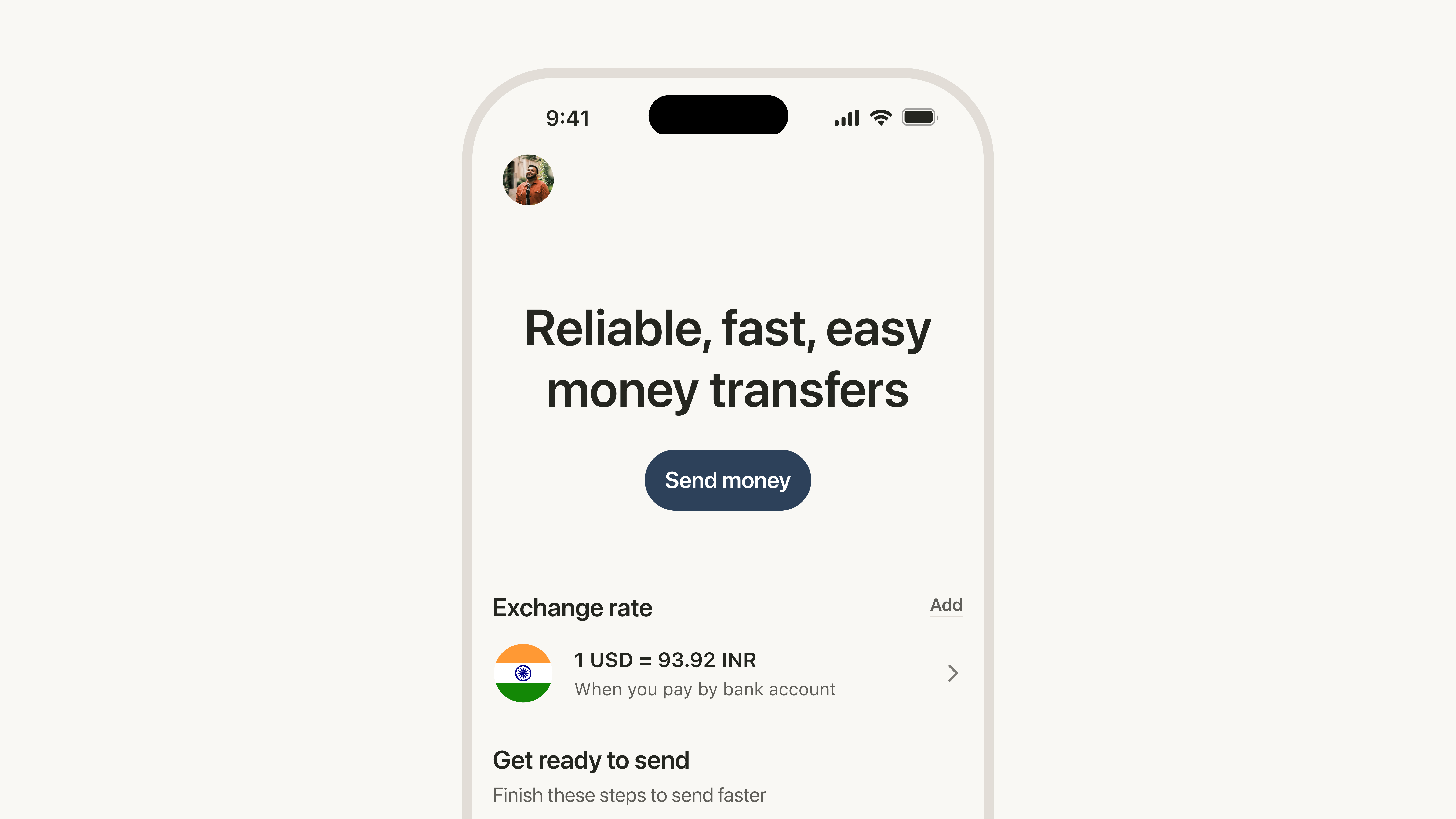
Remitly built its business on one thing: sending money home. For years, that was enough. Then the product grew - wallets, lending, store of value, payment requests - and Home never caught up. The screen 1.2 million customers open every day was still designed for a single action, built incrementally by different teams, each solving for their own section without a shared framework for the whole.
Year
2025–2026
Type
Product Design
Team
Product, Engineering, Research, Design Systems
Problem
Remitly's Home had become a fragmented experience. We rebuilt it around a single framework so the product could scale without losing sight of why customers came in the first place.
My Role
I was the sole designer on this project, partnering directly with my PM on strategy and leading all research. I owned the framework architecture and the navigation redesign, and drove alignment across Growth, Business, Wallet, Membership, and Marketing - all of whom had dependencies on where this was going. I reported to my director and the VP of Product, presenting at key decision points rather than recurring status updates.
The Framework
Home needed three things to be true: it had to prioritize action over information, organize around customer intent rather than org structure, and stay stable enough that customers could build habits around it. That last one is the constraint most teams underestimate. Personalization belongs inside sections - in what content appears and how it's ranked - not in reordering the sections themselves. Reordering sections with ML predictions is tempting, but it risks breaking habits that 9.3 million customers rely on.
Four fixed utility sections anchor every customer's experience: critical actions, shortcuts, the FX widget, and balance. Fixed because customers build habits around placement -- and habits are load-bearing. These sections don't move, don't personalize, don't get reordered by an algorithm. Stability is the feature.
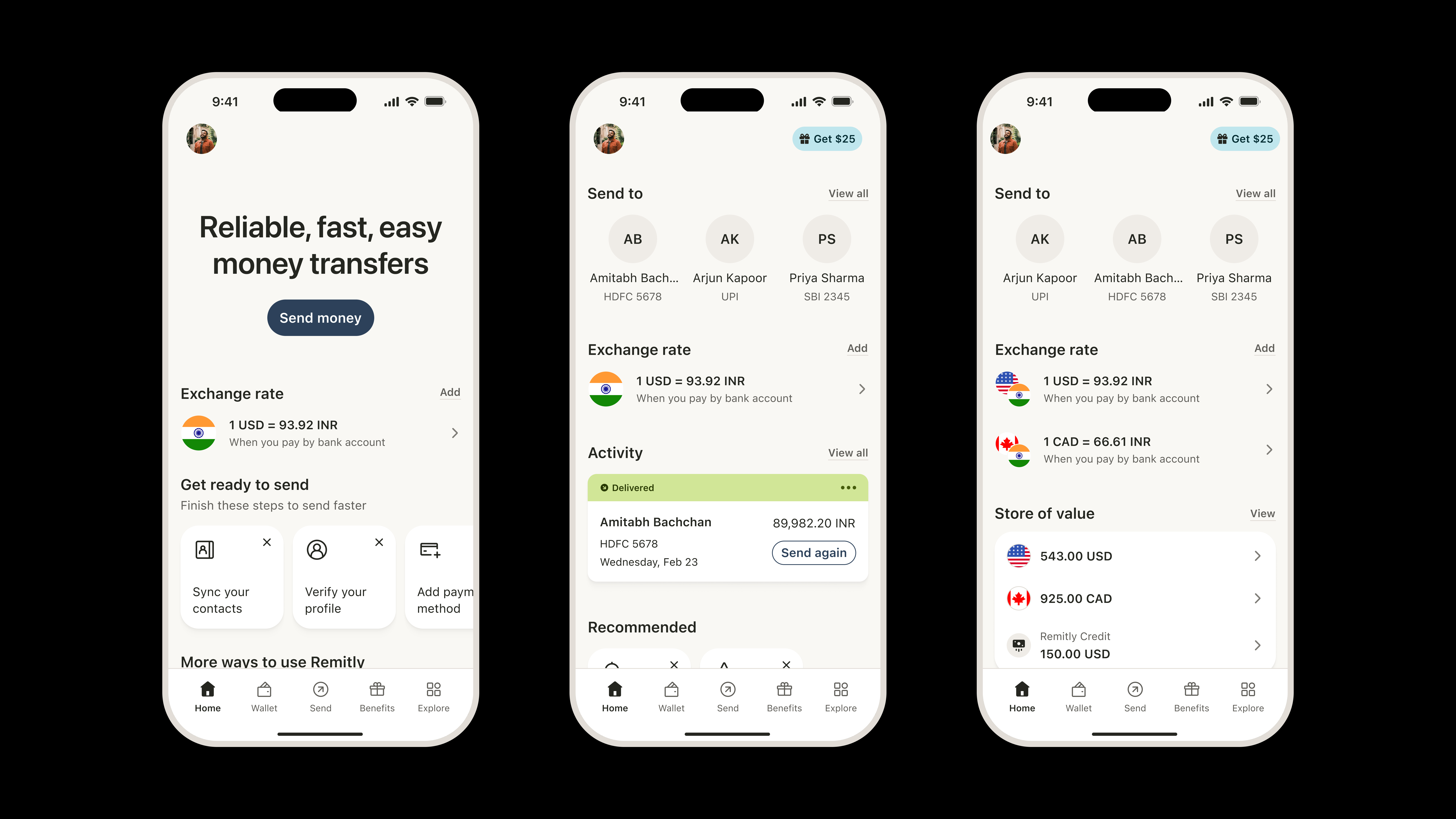
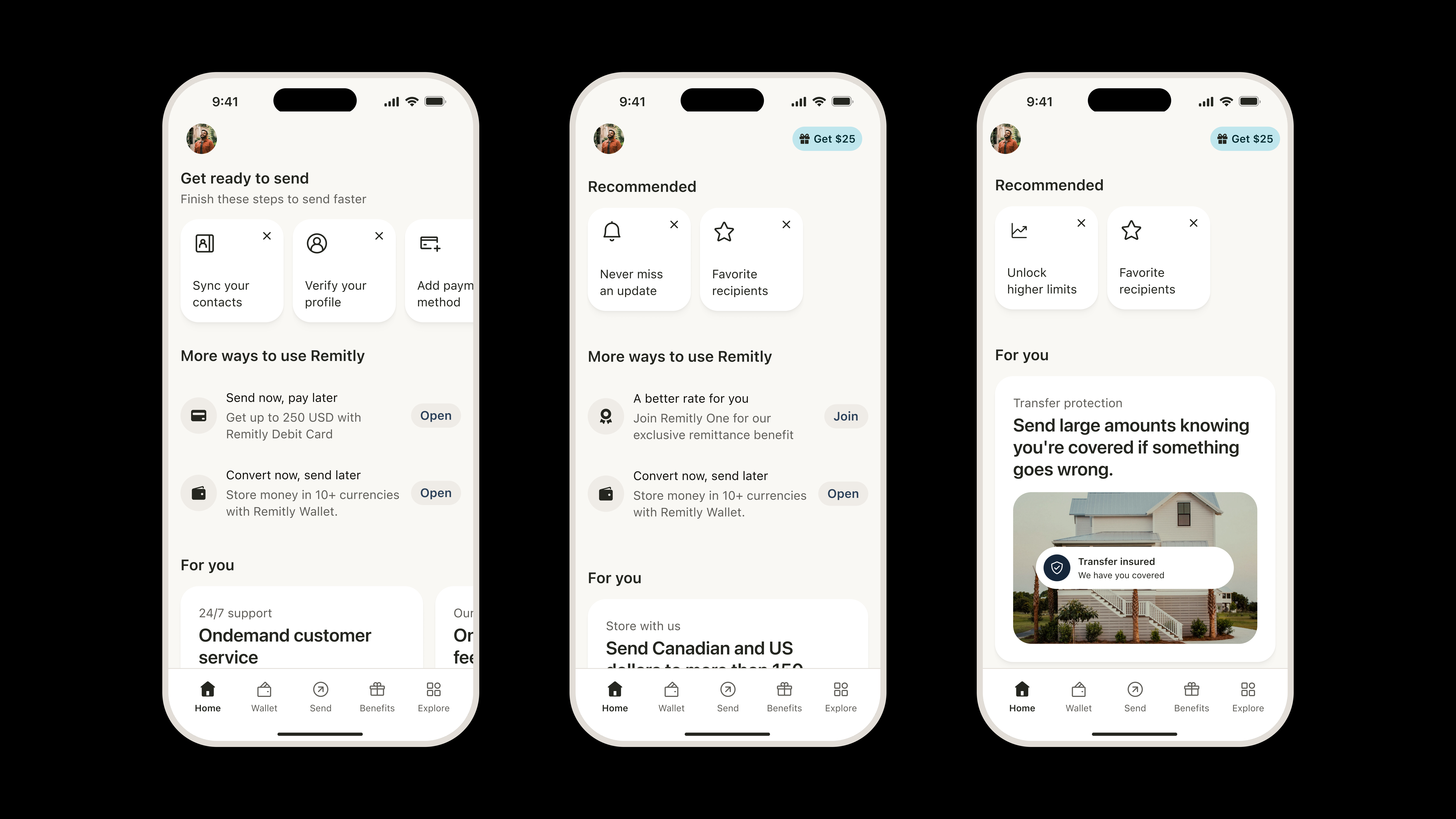
Merchandising
Three dynamic sections handle everything else: engagement tasks, expansion actions, and announcements. This is where new products enter. They get surfaced here, tested for adoption, and if they earn a place in customers' habits, they graduate into utility. The product can grow without the Home screen becoming incoherent.
Navigation
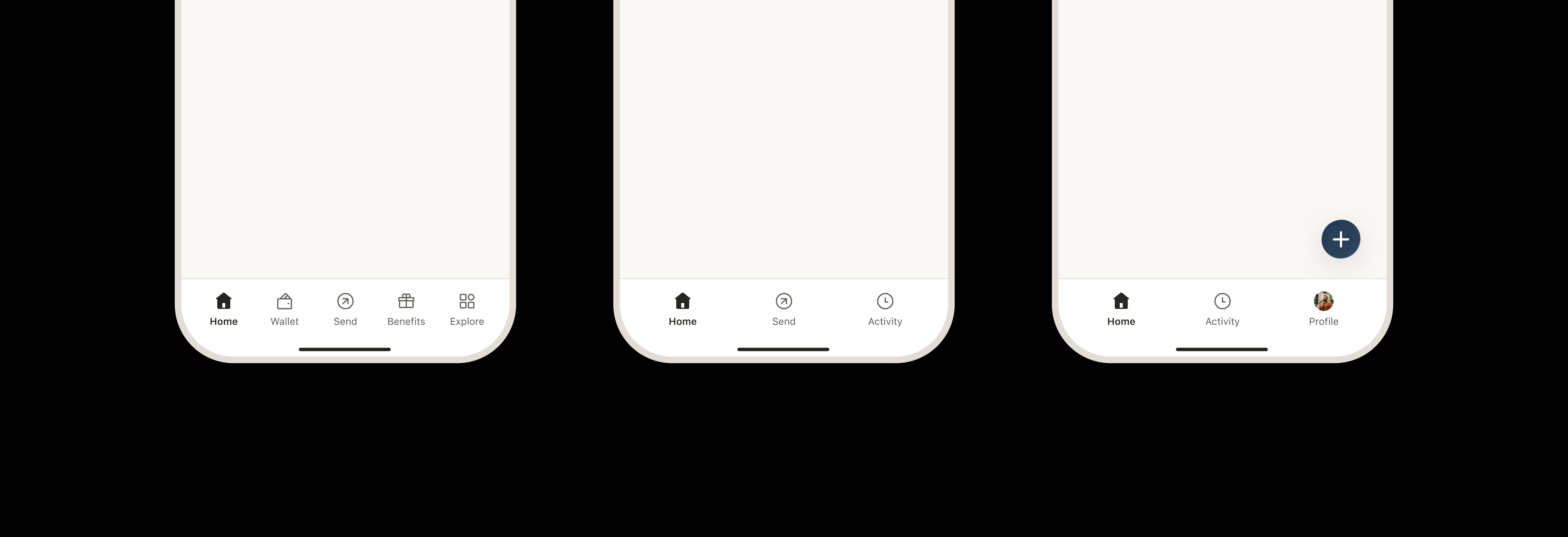
We started by fixing how navigation behaved -- keeping flows local rather than routing customers out to a different root. Once the behavior was consistent, the structural redundancy became obvious: the Wallet tab was prominent but the Home widget drove more transfers; Explore was abandoned once its content moved to Home. The tabs weren't doing anything the Home screen wasn't doing better. So we simplified to three destinations -- Home, Send, Activity -- built around what the product actually is right now, with everything else accessible through Home. The FAB is where it goes next: one contextual action surface that scales as the product adds complexity.
Impact
Cross-org strategic alignment. The framework and navigation strategy gained buy-in from leadership across Growth, Business, Wallet, Membership, and Marketing. Remitly moves incrementally and tests carefully, so the path to full execution is long - but having organizational alignment on the strategic direction is the necessary first step, and we got it.
$170M projected AMER send volume. Full-framework impact projection for 2026, the most impactful workstream in our team's roadmap.
3.12% drop from moving Wallet one position. The experiment that grounded the stable utility framework. Placement is load-bearing. The framework works with that, not against it.
+13% wallet signups via Home merchandising. When wallet was surfaced intentionally through next best actions and the Explore Remitly section on Home, signups rose 13%.